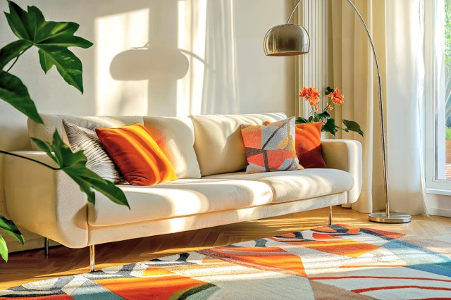
Whether you’re embarking on a room refresh or moving into a new space, selecting a cohesive color palette is a key step in the process. The shades you pick will affect all of your design choices, both big and small, from paint and furniture to artwork and accessories. There’s a Goldilocks-like balance to choosing a…
Luckily, there’s an interior designer-approved trick to nailing a harmonious color palette. Simply look down — the answer is in your rug.
In this YouTube video, interior designer Andrea Hundley of Design Morsels revealed an insider’s secret — that professionals often design a room by plucking colors from an area rug. (A large piece of art can be used in the same way.) If you already own a rug for the space, consider it a shortcut to an intentional color palette you’re guaranteed to love.
Rest assured you don’t need to use every color featured in a rug. You only need a few colors, whether bright hues or calming neutrals, to carry a space. If you’re working mostly with neutrals, layer in lots of texture — a bouclé couch, a woven wallpaper — to add dimension.
More from our network
House Outlook is part of Optimism, which publishes content that uplifts, informs, and inspires.
Follow the 60-30-10 Rule
Whichever colors you opt for, keep in mind that they shouldn’t be used evenly. Adhere to the timeless decorating rule of 60-30-10. One dominant color should account for 60% of the space, often through a paint color and large pieces of furniture. Use a secondary color that comprises 30% of the room, in elements such as window coverings and bed linens. Finally, an accent color — the remaining 10% — can add a punch of personality through accessories like throw pillows and lamps.
In Hundley’s video, she shares an example of a dining room with a vintage-style area rug that’s predominantly red with an oatmeal border, punctuated with washed-out shades of pink, orange, and charcoal. The room’s dominant color, oatmeal, is painted on the walls and represented in the upholstered dining chairs. The secondary color, red, is pulled in through the drapes, artwork, and flowers on the table. While not a perfect match, the orange accent color is reflected in the warmth of the brass chandelier, mirror frame, and chair legs.
You can enhance sight lines from room to room by using common colors in varying amounts. Going back to Hundley’s dining room example, you might consider using the same oatmeal hue in the adjoining living room as a secondary or accent color through a throw blanket or armchair. This creates a seamless flow as you move through the house.
Struggling to visualize how the room will look? Use Canva, a free online designing tool, to create a mood board with images of your rug, wall color, and furnishings.


